Conditions d’achèvement
1.3 Being able to transmit the project information to the learners
1.3.2 Use of simple and clear images and infographics
For a better understanding of the differences and specificities of bivalve molluscs farming sector in Europe, the course will integrate visual tools such as comparative tables or videos.
This approach will be particularly effective for an audience accustomed to the practicality and immediacy of information.
Below there a table that could be an example of how key data coming from the five countries will be presented, allowing for comparison of different realities and identifying potential mutual learning or collaboration:
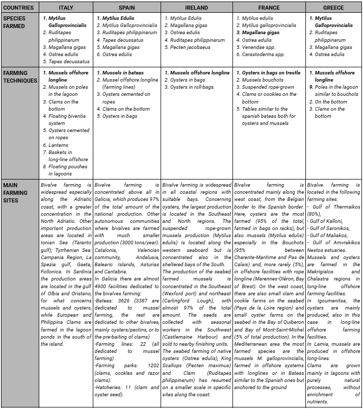
Table n.2 - Situation of the bivalve farming sector in the 5 countries involved in the project
In addition to tables of this type, summary tables were created during the preliminary Benchmarking Study for each country involved in the project, not only relating to the structural and geographical characteristics of the sector, but also to the problems and difficulties in terms of disease, mortality, product marketing, training, certification etc. These tables present 4 levels of intensity relating to the problems addressed: “not present”; “not so common”; “common”; “very common”.
These tables are also useful to give to the student an immediate overview of the state of bivalve mollusc aquaculture in their country (very orange and red = state with major problems - very green and dark green: sector with few problems).
In the table below there is an example relating to Italy.
Example of a table related to the Italian problems related to bivalve farming sector
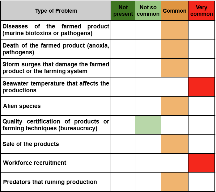
Table n.3 - Italian situation related to the problems that affects bivalve molluscs aquaculture